Internal commercial for IT leader training. The entire project was done within a week’s time, and the team was just me and the client (who wrote the script). I really like how it came out and is one of my favorite pieces.
One of my regular duties at SCTE — apart from developing training — was creating promotional videos for my department, showcasing our purpose and our latest offerings. For the few that I narrate I also wrote the scripts. Of particular interest is the NetworkSim 2.0 video, which showcases the custom 3D simulations my team and I produced. I’ve extremely proud of my staff in that we were able to develop the entire platform and all its assets in-house. A herculean effort by a relatively small team! Also, the last video shows a snippet of the AI-driven customer service simulation developed (again, completely in-house).
I really enjoyed working on both of these projects!
The first video is a 30-second social media spot for Los Angeles Education Partnership. I was given a script and a brand guide, and I came up with the designs, storyboards, and animations. The characters are very much my own, in that they all have features I tend to lean on a lot (bushy hair, eyes with no irises/pupils, pencil-necks).
The second video explains the reason for and importance of the Environmental Protection Bureau. This video was commissioned a few years ago when the future of the EPA was in question, and things have only gotten worse since then. The script was given to me, but I had a lot of input beyond that. I created the EPB logo (this was their first communication), the graphics and animation, as well as the music.
If you really want to know what I’ve been up to for the past 8 years, this is it! I produced hundreds — HUNDREDS — of these microlesson explainer videos for the telecom industry. The process was as follows: I meet with a subject matter expert who has outlined a script, then we develop a storyboard, and I go off to create all the artwork and animations. I also narrate the videos! If you don’t like the sound of my voice, then you wouldn’t do very well taking SCTE training. As I mentioned, the scripts were usually written in tandem with a SME, but I wrote the “Training vs Certification” and “Proctor Responsibilities” scripts myself since they were not technical training modules.
I worked directly for a pharmaceutical company for 9 years (Wyeth/Pfizer), then spent the next 7 years doing work for a number of pharma companies. Just off the top of my head, I created training and marketing materials for Abbott/AbbVie, Amgen, AstraZeneca, Biogen, Boehringer Ingelheim, CSL, GSK Jazz, Johnson & Johnson, Medimmune, Merck, Novartis, Otsuka, Pfizer, Shire, and Teva. Here’s a cross-section of work from that time period.
In order, these examples are 1.) Pfizer leadership meeting invitation 2.) Medimmune poster explaining the importance of documenting experiments 3.) Patient-centric selling WBT for a biopharmaceutical company (scrubbed) 4.) Wyeth vaccines brochure 5.) Healthy Cats for Life website for Boehringer Ingelheim 6.) Relistor promotional vertical banners for Wyeth.
See the Communication Graphic Novel entry and GOLD lion entry for other examples of my pharmaceutical work.
Last winter, I traveled to Reno to produce a series of training videos for Spectrum. They featured actual field technicians narrating how-to demonstrations and best practices. Like all remote shoots, there were some surprises to account for, but being flexible and thinking on your feet in those situations is all part of the creative process. Here are some still shots of the videos (due to their proprietary nature, I’m not able to link directly to the videos themselves).
This project literally started out as the "sketch on a napkin" cliché...a fully animated course that simulates a day in the life of a Record Center Specialist. A coach character guides the user through the standard procedure and encounters common issues that the user must correctly address.
I developed the character design, and my team and I created all of the artwork and animation. We worked closely with the developer, too, as this was a custom-built interface.
Explainer videos are for everyone! Here are two that deal with the science of data and marketing, specifically for the entertainment industry. This first is for a company in LA called ENACT Insight (formerly Guts+Data), the second is for joint collaborators Screen Engine ASI and Marketing Evolution, and the third is for a media archival company called MARBYL. In all cases, I was responsible for all the graphics and animations.
Large-scale panel graphics for various trade show booths
1.) PDG's booth at the LTEN Conference
2.) SCTE’s booth at the yearly TechExpo event (I included a few comps that didn’t get chosen)
There’s something satisfying about creating a one-page layout. Here are two handouts I created for PDG. The first is for business recruiting at universities, and the second was for the sales team to quickly extoll the virtues of graphic novels-as-training. I did the design and illustrations for both, and you’ll notice I used photo references of the same model in both layouts. I must’ve been going through a thing at the time.
I created this lion character (who has a different name, depending on the global region in which he is featured) for child formula packaging. It really took off, and you can find his likeness leveraged in a million different advertising scenarios. But it all started with my original concepts.
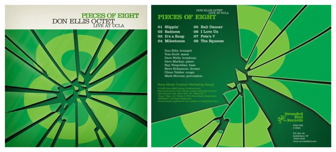
Music is the other creative passion in life. On occasion, I’ve been able to marry the two and design an album cover. I have personal connections with the artists represented here — trumpeters Don Ellis and Dave Stahl — the former with his musical estate and the latter having personally performed in his band for a long time. The last group of images were created for my current band’s single releases (available on YouTube).
Links to purchase the releases: 1.) Don Ellis - Pieces of Eight 2.) Dave Stahl Band - From A to Z 3.) Milcho Leviev: Multiple Personalities: The Music of Don Ellis 4.) Dave Stahl Band - Workin’
Here are two posters I designed for IKEA’s HR department. The bar pattern on the open enrollment poster was inspired by a motif that Reid Miles used on his Blue Note album covers (e.g., "Hub-Tones", "Shoutin'"). Some people might recognize the design being used for "LaLa Land" collateral, but I ripped it off first!
I created hundreds — possibly thousands — of technical illustrations for SCTE’s training materials. Here are some of the more interesting device drawings.
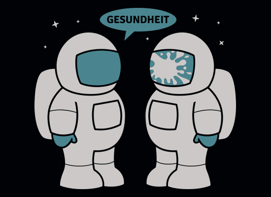
I don’t do t-shirt designs as often as I should, but here are four of my favorites. The first, entitled “Space Sneeze” is available from SnorgTees. The next two, which are out of print, were produced by Dusty Groove and RIPT Apparel, respectively. The last design was drawn freehand for Harmony Recovery Center in Estes Park, Colorado. It was commissioned specifically for a 5K run and not commercially available.
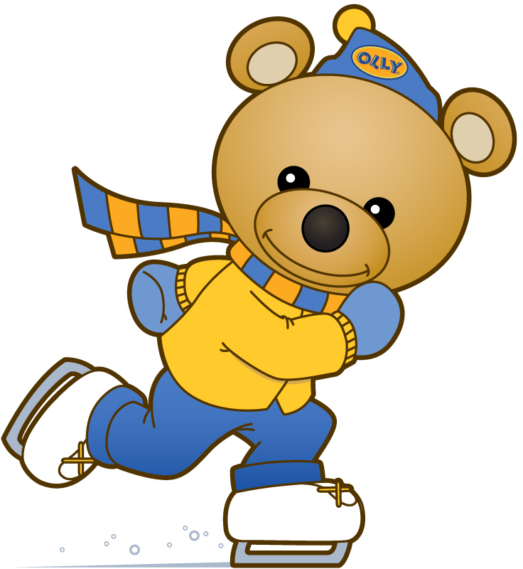
A bear character I designed for OLLY Shoes. I guess his name is Olly? I don't know...I never got to name him. His poses depended on what he was selling online at the time.
The classic corporate brochure…where would I be without it? I try to think of each layout as a new design challenge. Here are three different brochure covers/inside pages on the topics of talent onboarding (for PDG), professional development (scrubbed), and compliance (scrubbed).
I’ve been creating the family Christmas cards for the past 17 years. Thought they always featured caricatures of us, lately the concepts have been getting chaotic. Two of the cards shown here are ink on Bristol board, and the other two are actually pencil sketches.